Site Launch: Chautauqua Institution

I'm thrilled to announce the launch of Chautauqua Institution's redesigned site, over at CIWEB.ORG.
I was first contacted over six months ago to make minor modifications to Chautauqua's previous website. I guess we just clicked, because in the fall of 2010, I was asked to submit a proposal to redesign the site. I considered it a huge honor and considering the size of their site, I knew it would be a great challenge.
After months of planning, designing and building, the site is a thing of beauty, that I am extremely proud of.
One great step that the client is taking is to launch this as a "beta" version. This allows them to collect feedback from visitors. We're also planning a series of user tests in the weeks ahead, which is a great way to not only make sure visitors know how to use the site, but also make sure they can find what they're looking for.
"Because we focus on The Arts, we want the imagery to be the prominent feature."
The site features a unique jQuery accordion-stlye slider on the homepage, custom-built for Chautauqua. Each "landing page" has a different type of image slider, allowing the visitor to become immediately immersed in the experience.
I really wanted to let the typography have its own voice on the site, so I selected Proxima Nova, (my personal favorite) font available from Typekit. It's a great modern typestyle with classic angles, which seem to match Chautauqua's style nicely.
Here are a few screenshots of my favorite features. Be sure to Experience Chautauqua and tell them we said hello!
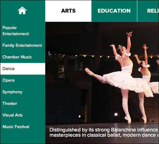 The Arts landing page with a tabbed image slider, intended to give the visitor a mini photo tour of each section.
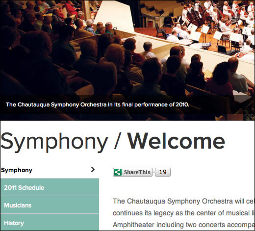 Bold "print-like" typography, showing Chautauqua's attention to style.
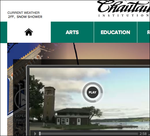 Custom XML/Javascript showing local weather and accordion-style jQuery animated slider.
